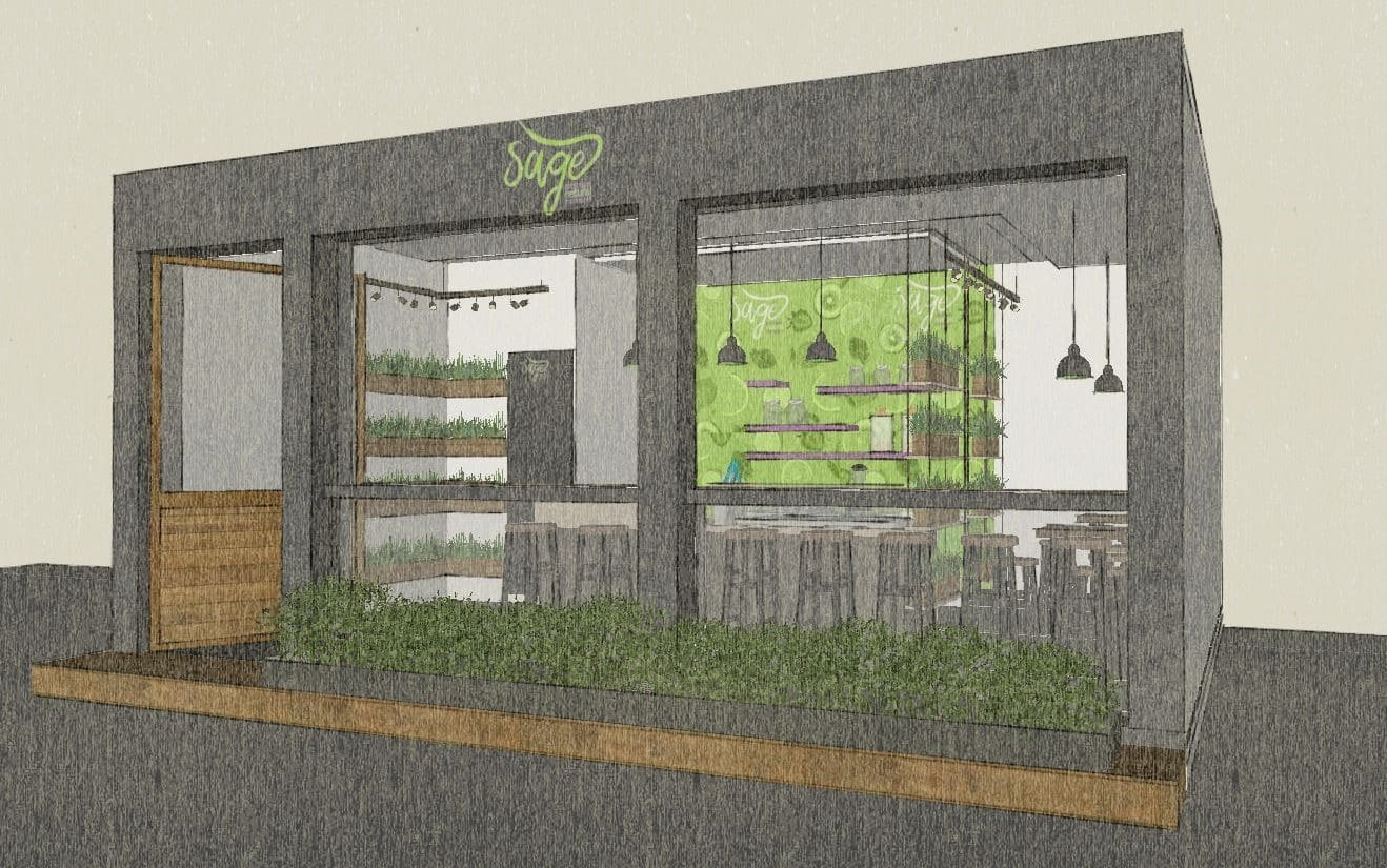
Article on Sage
One of the many perks of being an architect is being able to work with clients from various fields and backgrounds and learn new things with every project undertaken.
I’d like to share my experience with a recent client, where we had the chance to be a part of the thinking and design process, right from the brand initiation to the final store design.
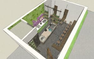
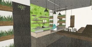
Sushmitha, an alumni of Sasi and I worked on this project together and created a look with a rustic yet fresh feel for a frozen dessert/ice cream startup brand in Coimbatore – Sage.
Working closely with the Creative Head of the brand not only helped us analyze and understand the roots and conception of the brand, but also gave us a chance to add to the design process and witness and contribute to the transformation of the brand from a single idea to reality.
The name Sage was chosen to depict freshly made ice creams with natural ingredients and the green logo denotes the purity, authenticity and ingenuity of the brand.
While ice cream brands these days focus on kid-friendly colors such as pink and purple and interiors made to attract millennials and young adults, Sage had a more sophisticated and niche approach.
Representing the ‘natural’ element of their in-house ice creams was pivotal.
The first phase of the project was to design a permanent outdoor kiosk for the brand’s launch. An exposed brick facade with clean, minimalist work spaces inside was used to accentuate the brand’s character while providing a rustic yet attractive feel to the set-up.


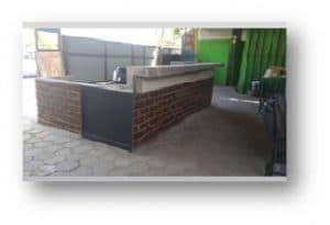
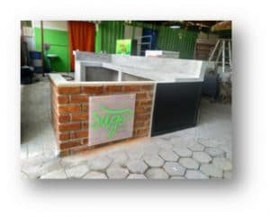
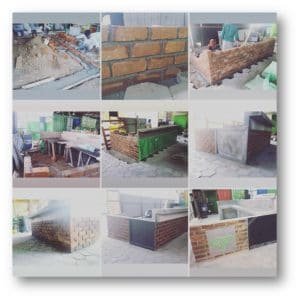

The design and execution was completed in just a month and launched successfully in Feb 2018.
n style=”color: #000000;”>After the positive response from the client and customers alike, plans for a store-front and franchise model are in the making.



The brand has showcased a ‘Less is More’ approach and emerged as a refreshing,
niche start-up in the field.

0 comments